Workflow
Workflow Platform for all kinds of business process and approvals
Products
More power to your work, starting today.
While your team is focusing on individual tasks, it can be hard to keep an eye on the bigger picture to see what’s working, what’s not, and whether you’re on track to deliver the project on time.
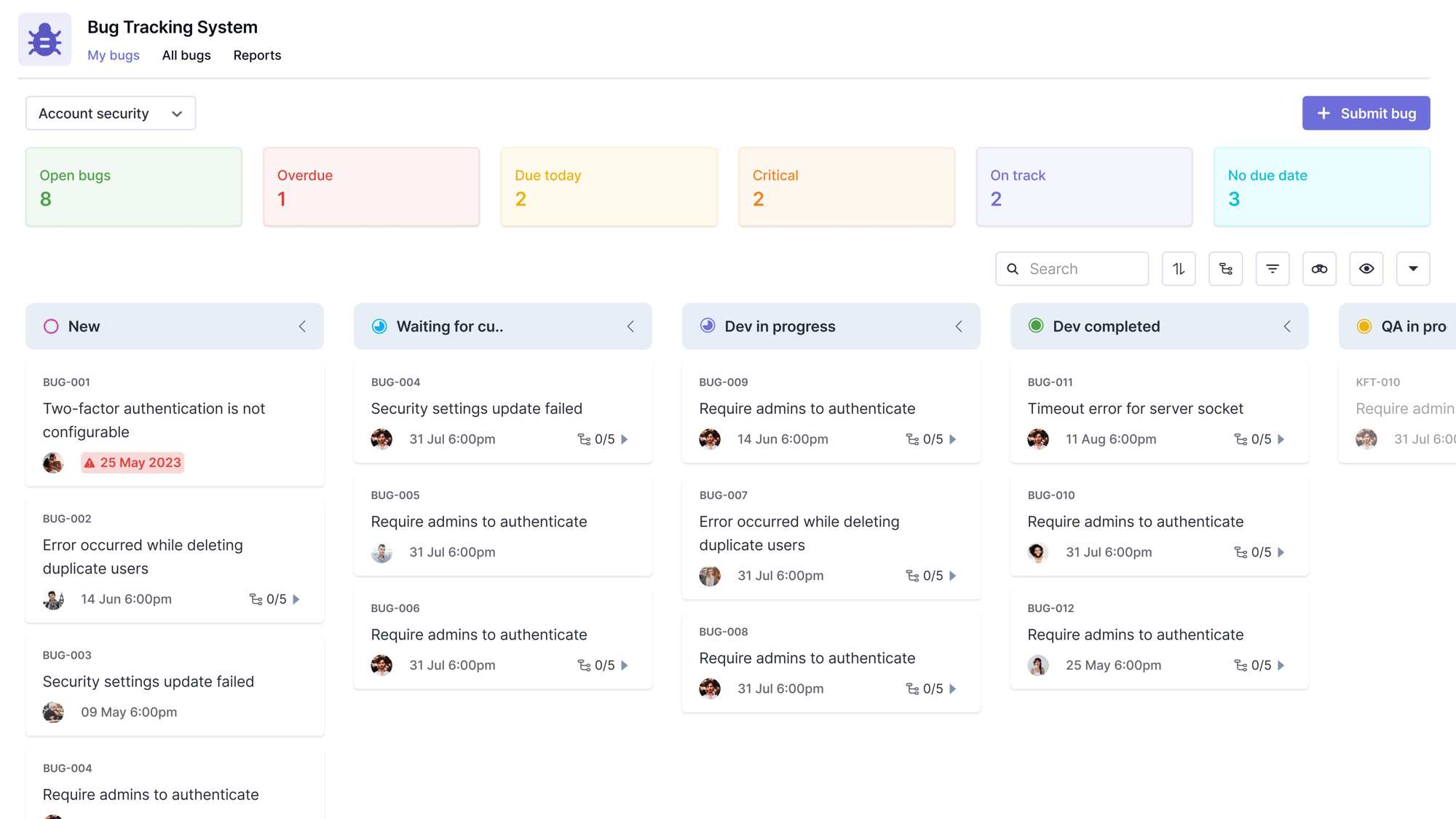
In Kanban, which is the project management methodology we’ll be focusing on for this article, you can have a look at the swim lanes and get a general idea of the tasks at each stage of the project management process.
But, what if there was a way you could visualize your tasks, based on which stage they’re at, to determine how fast you’re working and what needs to change to meet all your targets? There is, and that’s a cumulative flow diagram.
A cumulative flow diagram is a data tool, used primarily in the Kanban methodology, that shows a team how a project is progressing. It tracks all the tasks as they flow through the different stages, giving the team an easy way to visualize progress.
A cumulative flow diagram is a graph that visually depicts how the different tasks under a project are progressing from to-do to done. The vertical y-axis represents the number of tasks the team is working on for the duration of the project, while the horizontal x-axis signifies the time.
The graph is divided into three color-coded bars namely:
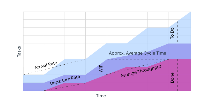
This displays three bars in the same graph, representing the number of tasks in each stage. As a matter of fact, the large graph is always correct since the sum of the number of tasks in the three bars always adds up to the whole.
Here’s how you read a cumulative flow diagram and use it to visualize your project progress:
This way, at every moment, the team can instantly have a high-level overview of how the project and its constituent tasks are progressing.
Cumulative flow diagrams are ideal in any situation where there’s a need to provide a clear overview of a project’s progress through the applicable stages.
In its most basic form, the cumulative flow diagram is designed for visualizing how tasks are progressing through the different stages of the project. The cumulative flow diagram is where all the data and details alike are simplified into an easy-to-use format where the team can have a look and see how fast they’re carrying out tasks. This in turn shows them if and how fast they’ll be able to hit their target.
An unusually skewed cumulative flow diagram can be used to uncover problem areas in your project management workflow or even how you carry out particular tasks.
Let’s say your record for carrying out a particular task is just 3 days with 4 experts working on it. But, looking at a cumulative flow diagram, you discover this task has remained in progress for over 6 days, with 3 experts working on it.
With that data, you’re able to see that there are bottlenecks that need to be removed and that’ll help you dig into your process and see if there’s something that needs to be fixed.
– Marketing Plan Template to Streamline your Marketing Efforts
– Social Media Calendar Template for Social Media Planning
Charts and graphs are a huge part of project management, no matter what methodology you’re using. As a result, it’s easy to confuse some terms or tools judging by how similar they appear to be. That’s particularly huge in the case of the cumulative flow diagram that’s quite similar to both the burndown and burnup charts. The differences might be a bit difficult to spot, but they are essentially what make these charts useful to us.
The cumulative flow diagram shows how workflows from to-do, to in progress, and done. Also, it makes use of color-coded bars right in the graph to show that while the work moves from one stage to another, it all stays in the same project, and therefore remains within the graph.
On the other hand, burndown charts show tasks plotted against time, moving from as many tasks planned for the project and counting down to zero as the tasks get completed. Learn more about the burndown chart here. The burnup chart works as the inverse of the burndown chart. It shows a graph of tasks completed over time as a sprint progresses. While the burndown chart moves from top-down, the cumulative flow diagram and burnup charts move from down up.
So, while the cumulative flow diagram tracks task progress through stages, the burndown chart tracks task completion, counting down from the number of tasks until it hits zero, i.e. when the project is completed. The burnup chart records task completion from the ground up.
Whether you’re managing projects with Kanban or using other project management methodologies, a cumulative flow diagram is a must-have. It is designed to simplify the process of tracking project progress and identifying problem areas in your workflow.
We have built a FREE solution. Just for you.
Managing a project is no easy feat, no matter what the scale and scope are. ...
Project management tools are the project manager’s answer to manage projects. ...
Whether you are someone just starting your career in the field of project ...
Copyright © 2022 Kissflow Inc. All Rights Reserved