<img alt="" src="https://secure.insightful-enterprise-52.com/784587.png" style="display:none;">
Agile

What are Burndown Charts and How to Use Them?

17.11.2023

Data visualization is essential for you if you want to be an effective project manager. Using statistics, graphical illustrations and other visualization tools make communication and collaboration easier for everyone involved in the project. Among such tools is a burndown chart, which is quite popular due to its simplicity and effectiveness.

What is a burndown chart?

Burndown charts graphically illustrate how fast your team is working by plotting user stories against time. It works from the end user’s perspective, so the chart is only updated after the successful completion of a user story. The burndown chart is also used to record a team’s pace, called velocity, and predict their performance.

In agile projects, burndown charts are generally of two types – product burndown charts and sprint burndown charts.
Product burndown charts focus on the big picture and visualize the entire project. The chart tells you how many of the product goals your team has achieved so far and how much work is left. Rather than dates, the horizontal axis shows you the sprint number while the vertical axis shows the story points.

The sprint burndown chart only focuses on the ongoing sprints. The user stories it displays are based on the ones selected by the team in the sprint planning session. Unlike the product chart, this burndown chart uses days on the horizontal axis to judge the performance.

Most product teams use a combination of product and sprint burndown charts to gauge their performance. It’s displayed in a central location in the office or digitally shared with everyone to keep the operations transparent and let everyone know the current standings of the team.


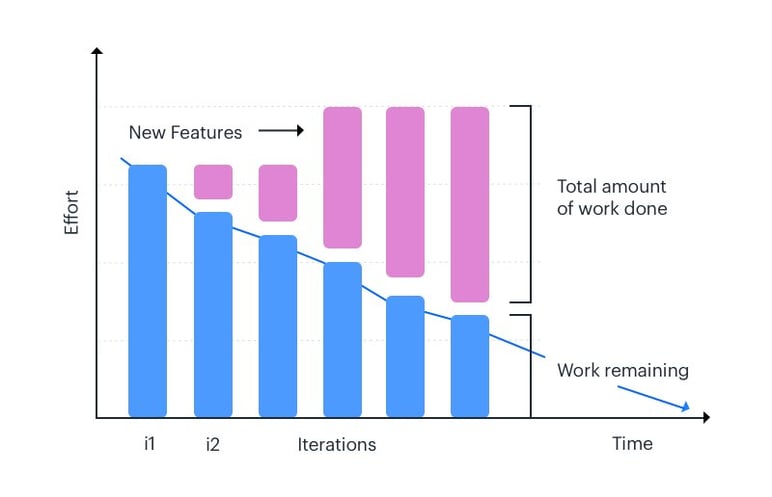
Using burndown charts in an agile project

Before knowing how to read a burndown chart, you’ll need to know the information it gives you. A simple burndown chart gives you the following data:

  • Total work at each point in time/ iteration
  • Remaining tasks
  • The actual speed of the team
  • Estimated speed of the team

In some cases, managers can even use the burndown chart to keep an eye on scope creep and prevent their project from getting off track.
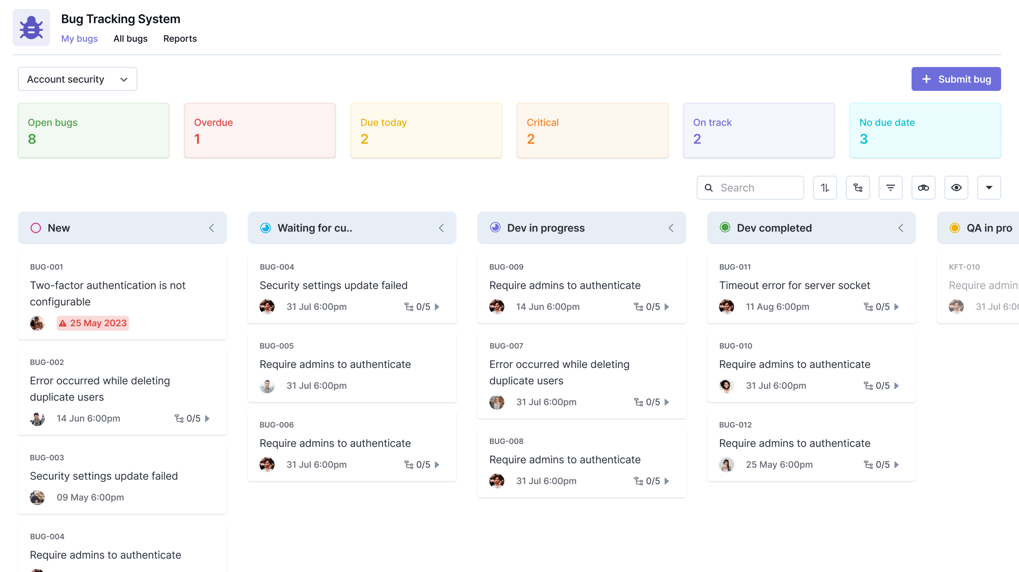
Burndown Chart report in Agile


Components of a burndown chart

The burndown chart has many components. Its axes are used to display time/iteration (horizontal) and the user story points (vertical). The starting point of a project is on the leftmost point, which is also the highest part of an ideal burndown chart. The rightmost point of your graph illustrates the end of your project or sprint.

On many burndown charts, you’ll see an ideal work remaining line which is either dotted or uses a different color. This line uses the past performance of the team to estimate their performance and gives you a measuring stick to judge your performance. One distinguishing feature of the ideal work line is its constant slope. In reality, teams work with different velocities throughout the project.

The actual work line on a burndown chart shows the real progress of the project. The actual and ideal work lines share the same origin, but the actual line either goes above or below the ideal line according to the situation. If the actual line is above the ideal line, your project is running behind. Similarly, the actual line being below the ideal one means your project is ahead of schedule.

The benefits of using burndown charts

The most important characteristic of the burndown chart is its simplicity and adaptability. With this chart, you can get a lot of information even when things are not ideal in your project. The chart also gives a direct comparison between the planned and actual progress, so you can immediately tell if things are not going according to your plan.

The visual representation burndown charts offer is a huge help to maintain effective collaboration. Managers need to keep everyone in the loop and on the same page. A burndown chart provides status reports and does not take too much time to make and read, so everyone can keep track easily.

A burndown chart can also prove to be an excellent motivating tool for team members. It keeps everyone involved and the constant comparison with ideal performance on the graph encourages members to perform consistently. In most agile workplaces, the burndown chart has special importance and is usually the focal point of the room as it keeps everyone updated and focused on their jobs.


Burn up vs. burn down charts

Burnup charts are another popular choice to visualize the project. Burnup charts are similar to burndown charts as they share the same coordinate system. However, a burndown chart shows all the remaining work and burnup charts tell you how much you’ve achieved yet.

Unlike burndown charts that proceed in the downward direction, burnups charts start from the bottom and climb up. Burnup charts also have a separate scope line that indicates how far your product is from the requirement. For a successful project, the progress line of the burnup chart meets the scope line in the end.

When it comes to simplicity, burndown charts win because of their approach. Burnup charts, however, show more details and can tell you about the changes in scope beforehand. Burndown charts will only register changes in features and scope after the iteration is completed. With burnup charts, you can plan for changes in scope and increase your efforts to meet the deadline.

Key takeaways

Burndown charts are important aid for project managers due to their features and flexibility. They once were exclusive to agile scrum teams but now they have moved beyond scrum and are used by any manager irrespective of the methodology.
Burndown charts are only a start. Any effective manager uses multiple project management tools to visualize the project and make the job as simple and possible.