What is business process analysis?
Business Process Analysis (BPA) is not merely a tool—it's a strategic necessity. It is a guiding compass for CIOs and BTPs, helping them align IT strategies with overarching business goals and spearhead transformative IT initiatives.
Deep dive into business process analysis, highlighting its immense value and influence on business operations. From process optimization to innovation stimulation, this guide empowers tech leaders by giving them the knowledge and insights they need to leverage BPA as a strategic resource. This ensures that every aspect of their organization is primed for success in today's digital era.
Don’t confuse business process analysis with business analysis
It’s easy to mix up business process analysis (BPA) with the more common term, business analysis (BA). There are some overlaps between the two concepts, but they are distinct disciplines.
Business process analysis software is designed to collect data and generate actionable insights specifically aimed at improving an organization’s core processes. Unlike general business analysis, which addresses a wide range of organizational needs—such as financial planning, market research, recruitment strategies, and cost optimization—business process analysis software zeroes in on streamlining and optimizing operational workflows.
When should you apply business process analysis?
When applied to the right ‘as-is’ process, business process analysis gives a clear understanding to the process owners so that they can make a sound judgement.
Here are some cases when you should use BPA:
- Unidentified issues like regular delays or increased customer complaints
- Process stakeholders are unclear about how to carry out a process
- Before introducing automation to make sure the process is optimized
- A team wants to replace a process with a new version
How to Analyse a Business Process?
Business process analysis follows a 4-step plan:
(i) Identify The Process
The first step is to choose the ‘as-is’ process to be analyzed and identify the stakeholders who handle it. Be sure to have a clear starting and stopping point for the process.
(ii) Collect Process Information
Next, gather as much information about the process as possible to understand the issues it faces, the objectives, the scope of improvement, and other goals of the analysis.
(iii) Analyze process
Implement a business process analysis plan. Get to the bottom of the identified process, define the process in flowcharts and other diagrams, and measure its effectiveness.
(iv) Develop to-be plan
Finally, use the analysis to make recommendations how a ‘to-be’ process should look. Point out the requirements, suggest resources and changes, define a timeline, etc.
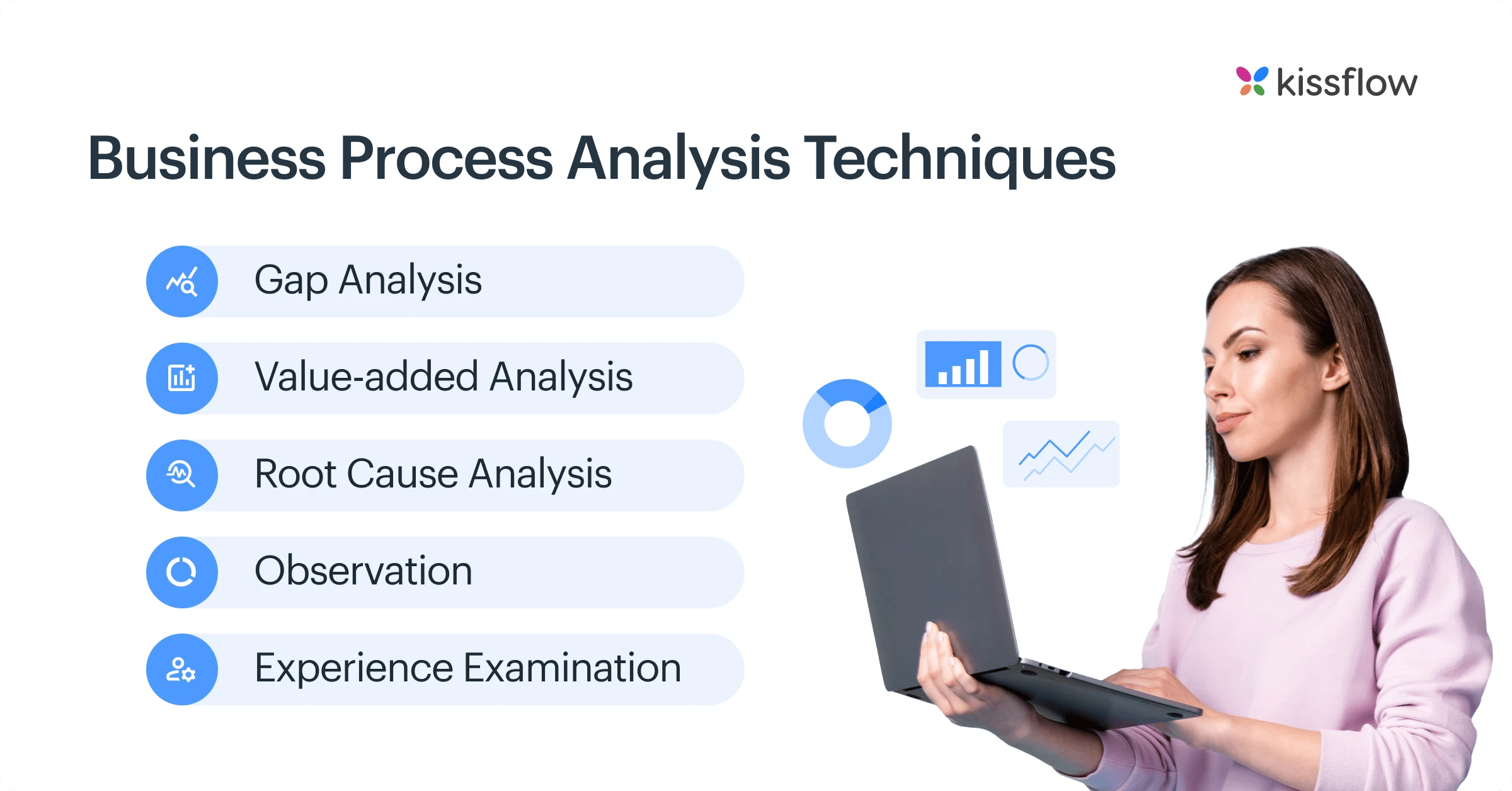
Business Process Analysis Techniques

Okay, all of this sounds good. But you’ll need actual techniques, not abstract concepts to understand how to analyse your business processes and their different metrics.
Here are some of the popular Business Process Analysis techniques that are used in most of the businesses.
-
Gap Analysis
(Find out what information you’re missing about the process)
-
Value-added Analysis
(Find if each and every activity in your process adds value to the process or your organization. If not, remove it)
-
Root Cause Analysis
(Find the core reasons for a problem and see what can be done to fix it)
-
Observation
(Observe the process in action on the floor, see if it works as intended or not)
-
Experience Examination
(Talk to experienced staff in your organization, see what inputs they have)
What benefits does an organization get from business process analysis?
Broadly speaking, business process analysis gives companies a better understanding of how processes are running and how they can be improved.

Here are the most common benefits of business process analysis:
- Clear documentation of the process and greater understanding
- Robust data on how the process is performing
- Identify the obstacles that cause delay to certain processes
- Identify which user actions are hindering the process and where inefficiencies are
- Better training for new employees taking on the process
BPA might use a range of tools and various methods to dissect processes from different angles in order to measure their performance. Business process automation software will use this data to analyze how well the current processes are working to achieve the business goals and make relevant recommendations.
Opt Kissflow for your business process analysis
Choosing Kissflow for your business process analysis is a strategic move towards operational excellence and innovation. Its comprehensive capabilities tailored to meet the needs of CIOs and BTPs serve as a reliable compass guiding your IT strategies and business objectives. Modern process automation software allows companies to replace manual, time-consuming tasks with automated workflows that scale. This shift not only improves accuracy but also accelerates the pace of work across departments.
Harness the power of Kissflow to dissect and optimize your processes, drive transformative IT initiatives, and ensure every aspect of your organization is set up for success in the digital age. Don't just adapt to the future; shape it with Kissflow.
Solve your workflow challenges with Kissflow and optimize your team's productivity.
Related topics:
Business Process Mapping Guide 2026: Key Steps
Process Mapping Techniques and Methods | Ultimate Guide of 2026
Business Process Mapping Software - Kissflow
What are Process Performance metrics? | Find out its importance in BPM
BPM KPI | How to Use KPIs to Measure Business Process Management Goals
Frequently Asked Question:
1. What is business process analysis and why is it important?
Business process analysis systematically examines existing processes to understand their performance, identify inefficiencies, and recommend improvements. It's important because it reveals hidden bottlenecks, quantifies process performance, identifies value-adding versus non-value-adding activities, creates standardization opportunities, establishes improvement baselines, and ensures processes align with strategic objectives.
2. How does process analysis improve efficiency?
Process analysis improves efficiency by identifying redundant steps and bottlenecks, establishing clear handoff points between departments, documenting decision criteria at key points, providing a baseline for measuring improvement efforts, understanding resource allocation issues, identifying training needs, and creating a common understanding among all participants.
3. What industries require process analysis?
Industries requiring process analysis include manufacturing (production optimization), healthcare (patient journey improvement), financial services (transaction processing efficiency), logistics (supply chain optimization), and government agencies (service delivery enhancement). Any organization with complex operations, compliance requirements, or high transaction volumes benefits from systematic process analysis.
4. What tools help businesses conduct process analysis?
Tools helping businesses conduct process analysis include process mining platforms automatically discovering process flows from system logs, simulation software for testing improvement scenarios, value stream mapping tools identifying waste, BPMN modeling tools documenting process designs, statistical analysis software quantifying performance, and collaboration platforms facilitating stakeholder input throughout the analysis.
5. How do businesses optimize processes using analysis?
Businesses optimize processes using analysis by establishing clear improvement objectives, gathering baseline performance data, identifying value-adding versus non-value-adding activities, removing bottlenecks and redundancies, standardizing best practices, implementing appropriate automation, realigning resources to match process demands, and establishing continuous monitoring mechanisms to sustain improvements.


